Being a digital medium means that website design is more susceptible to various technological shifts when compared to the more traditional printed counterparts. But what is truly astounding is just how web designers cope with the ever-evolving technical difficulties and managed to develop websites that are consistent, clear, device-adaptable and, more importantly, friendly in regards to the end user.
There have been many innovations in 2017, due to mobile browsing overtaking the use of desktop browsers. This means that 2018 will bring even greater utilization of mobile functionality in new, never-before-seen ways, while desktops continue evolving in order to remain relevant in the future. So, what are some of the useful trends we might expect to see in web design in 2018?
1. Minimalistic design
Minimalism has and will continue to dominate the world of web design. Fewer on-page elements mean that there’s less interface to work with to provide visitors with the same level of usability. On the other hand, having only a few elements means there less development work for a website that ultimately loads faster.
Balancing functionality with breathtaking aesthetics requires a unique use of space (or the lack thereof), contrast, striking visuals and placing content directly into the spotlight. Add dramatic typography, simple navigation, and some visual harmony into the mix and you’ve got yourself the pillars of minimalist web design.
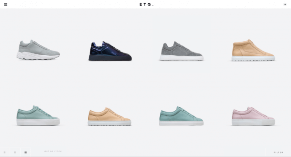
[source: https://www.etq-amsterdam.com/]
Negative is featured heavily in minimalistic design, however, it’s far from being a tiny visual drowning in a sea of colorless expanse. In fact, as often as white backgrounds, black and dark backgrounds are used, there are designers who base their negative space using full-color backgrounds. A rule of thumb states that our eyes are naturally drawn towards element surrounded by negative space. This not only helps developers create designs that allow them to organize on-page elements more comprehensively and even increase your conversions by ensuring they’re not being overwhelmed by the design.
2. Attention-grabbing color schemes
Web designers have been using bold colors extensively across a multitude of digital platforms. Today’s mobile devices and computers screens and monitors have screens far more capable of reproducing rich colors. Designers are moving away web-safe colors and experimenting with hard-angled headers, vibrant shades, and supersaturation. It’s already interesting to watch up-and-coming brands rely on effervescent colors to attract visitors’ attention instantly, but it will be even more interesting to see brands using colors to customize and personalize the user experience and make it even more exceptional.
3. Bold and inventive typography
But colors aren’t the only design element expected to become even bolder in 2018. A very powerful visual element and a valuable web design tool in the hands of design experts, typography is used to create a brand personality, evoke specific emotions and set the stage for conveying relevant information. Whether you’re creating a logo, printing business cards or using a recognizable font to represent your entire brand like Coca-Cola does, the importance it role plays in today’s design cannot be overstated.
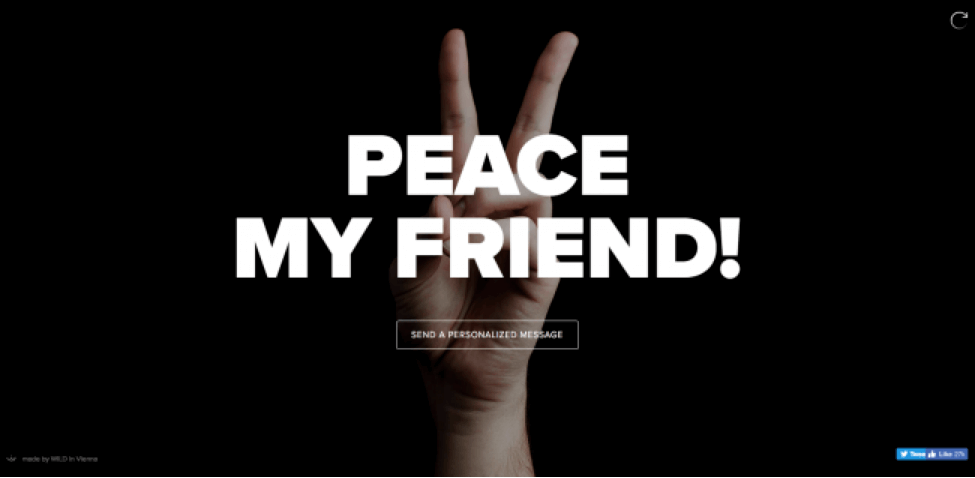
[source: http://sendamessage.to]
While the serif heading/sans-serif contrast is hardly going anywhere, the continual increase in screen resolutions and sharpness can only result in even more custom fonts being used to keep the visitors from bouncing off the site.
4. Mobile-first design
As we already mentioned above, mobile use has surpassed desktop use, with the majority of people making various shopping and doing all their shopping on their mobile device. Mobile web design has matured tremendously to the point of becoming mobile-first, with the roll-out burger actively being used to further minimize menus on smaller screens.
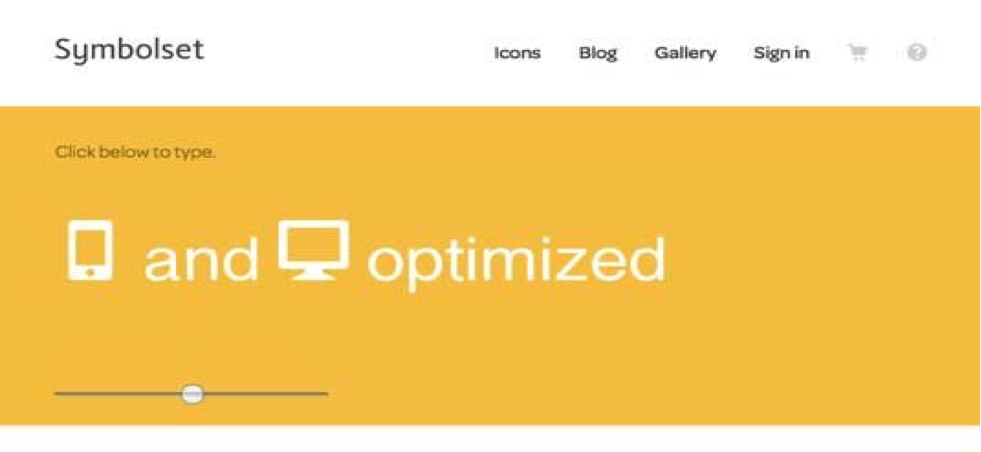 [source: https://symbolset.com]
The continuation of this mobile-first trend will require developers to consider their use of complicated transitions and large animations and their translation into mobile and focus their attention on gestures and micro-interactions and use that information to create sites that are intuitively navigable. Due to its scope, this type of design work, as well as general mobile-first development is best accomplished by design teams instead of freelancers and individual contractors so make sure to check out Design Rush’s list top website development agencies in case you need any help with mobile-first design.
5. Speed-related optimization
Nothing has changed when it comes to users losing their patience due to prolonged loading times and poor website performance. If your website takes more than three seconds to load, visitors will abandon it without thinking. This falls in hand with reduced animations and lighter page transitions while maintaining consistency across the different platforms. Particle backgrounds are an excellent solution for performance issues, as these lightweight JavaScript animations allow for background movement without being too heavy on the file size.
Conclusion
These trends will, without a doubt, be highly prevalent in the following years, but they are certainly not the only trends to do so. Putting together lists such as this one is an ungrateful business, as some trend predictions may not turn out as planned, while those that didn’t make the count could. At the end of the day, this is not a definitive statement and more of an information-based prediction. Make sure you treat it as such and let us know in the comment section below about the trends you think will dominate the year.
Follow Us