If you are anything like me, you get much more excited about writing copy for landing pages, as opposed to finding images for them.
At one point in my career, I was completely convinced that I was never going to be able to handle the visual aspect of creating landing pages. I can format text well and make my writing easy to read, but adding any kind of visual aid – hopeless.
Luckily, I’ve overcome that issue. With time, I’ve also become quite adept at coming up with images that not only go well with my words, but that enhance them and take them to an entirely new level.
Here are some of the tips I have learned along the way, and five great landing page examples to illustrate my point (pun not intended).
Option one: showcase the product
When choosing images for a landing page, you can choose to showcase the product by putting front and center. This is an excellent way to cut right to the chase and show visitors what it is you’re selling, without resorting to any kind of copy to begin with – as you are letting your images speak louder than your words.
Here is an example from Zoma:
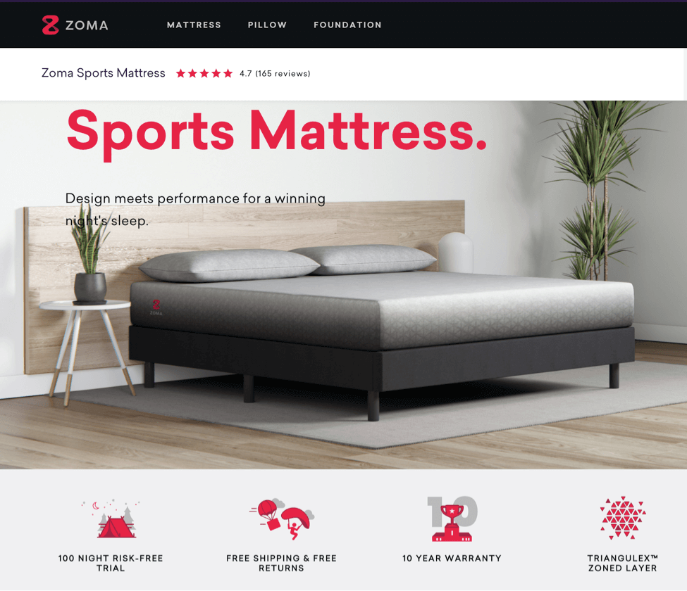
They have cut down on their copy and have simply incorporated an image of their product – stylish, with easy-on-the-eyes colors, and without any excess. For a product like theirs, this is the best solution. After all, how much can you even say about a mattress that will explain it better than an image?
Option two: evoke some emotion
On the other hand, if you don’t have a product to show, or even if you do, but want to go down a different route, you can choose to play the emotion card.
Here, you are playing with your customer’s psyche and trying to show them what your product or service will make them feel. Depending on the product, this can be a much more prudent way to go, as emotional heroes are often a great way to spark an instant connection and get people more interested to explore further.
Here is this example from Haystack:
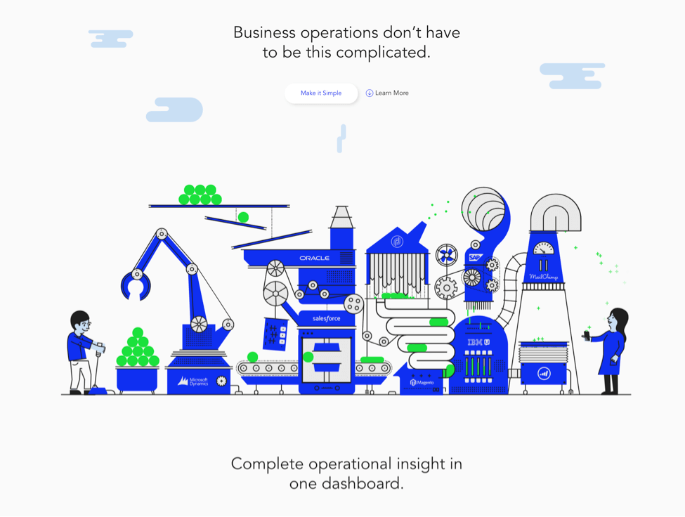
They have chosen to go the negative emotion route, toying with the idea of how their customers are feeling now. When you click on the Make it Simple button at the top, the illustration morphs into a much more manageable image that is in line with their brand and removes a lot of the stress the initial image has ignited.
Option three: illustrate your point
If you don’t want to play the emotion card, or if you offer a service that can’t be showcased with an image, you can choose to illustrate your point with an image that will tie in with the service and allow customers to dive deeper into your offer with a bit of virtual stimulus.
Here is this example from Ultimate Meal Plans:
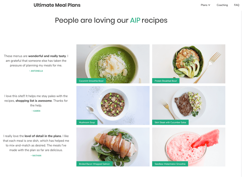
While they can’t slap an image of all the foods their meal plans help you make on the screen, they have added an image that, if you look closer, consists of only healthy food options, blends really well with the tone of the entire page, and lets users move on without cluttering their minds.
Landing page image best practices
Apart from the three routes we’ve just outlined, there are a couple of other points to keep in mind:
Choose authentic images over stock photos
Rather than buying stock photos, which anyone else can use on their website as well, try to always use original and custom images for your landing pages. This can mean hiring a photographer to take some in real life, or hiring a designer to come up with something unique.
Take the example of Upwork:

While they could have easily gone for stock images, they’ve chosen to showcase their actual users, a.k.a. their successful freelancers, on all of their industry-specific landing pages, which makes them much more approachable and relatable.
Keep your design clean
You don’t want the image to be cluttered, garish, over-vibrant, or in any way distract the lead from the story you’re trying to tell and the action you want them to take.
Here’s Hubspot:
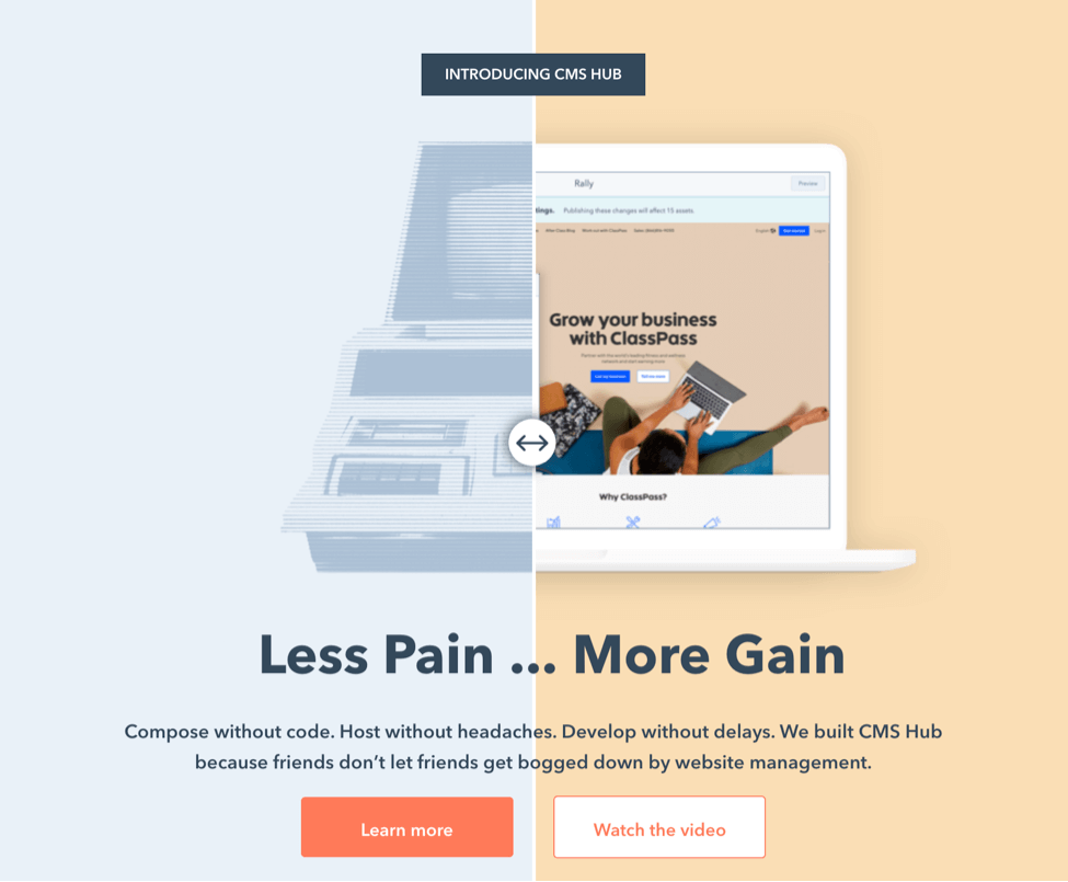
They have chosen to incorporate their signature orange across their different landing pages, softening it with the green they use so effectively on the homepage as well as on other parts of their website as a highlight. The design is sleek; it’s not distracting, and it ties in with their overall brand image.
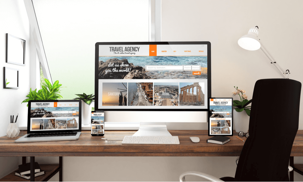
Make sure your images are mobile-optimized
Another very important point to bear in mind is that your customers will come to you from different devices. Your images need to show up well across all of them.
When selecting your landing page images, make sure you consider how you want them to show up on a mobile device or any smaller screen. Do you need to cut out a certain portion? Do you need to zoom in? Is the image even optimizable for mobile?
Consider how small mobile screens are compared to desktops, and how functional the design of your CMS is. Can you optimize something for mobile, and how?
Final thoughts
Don’t make the mistake I did and write off landing page imagery as less important or too difficult to master. With these tips and examples, you should be able to come up with an image story that aligns well with your brand, website design, and campaign goals. Remember, you want to stay unique and relatable and provide some real value to your leads – and your images should be a stepping stone on that quest.
Follow Us